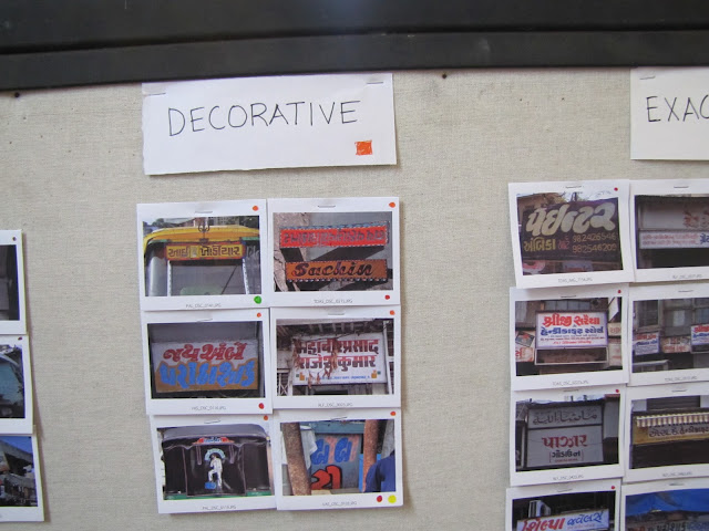
Manoj compiled all the photographs in 2" x 3" frames and printed them out for categorizing. Sachin bhai from the NID printlab was kind enough for cutting these up
We have started the long process of categorizing our references into "FORM" and "VISUAL REPRESENTATION".
Form, consists of 2 sub-categories :
• Monoliner - Having vertical and horizontal strokes of the same visual weight
• Modulated - Having vertical and horizontal strokes of different visual weight
Visual Representations consists of 9 sub-categories :
• Shadow - The Lettering has a distinctive shadow.
• 3D - The lettering has either a distinctive 3D geometrical effect or has a 3D extrusion.
• Geometric - The lettering is constructed with sharp geometriclines and edges.
• Fill in - the lettering has colour filled in its negative space.
• Decorative - The lettering has decorative elements in it.
• Outline - The lettering has a colour outline.
• Vignette - 2 or more colours are mixed making a vignette.
• Distortion - The lettering is conciously or unconciously distorted.
• Exaggeration - The lettering has some letters drawn in a completely different way and some elements
are exaggerated.
We have now further linked various images which have more than one traits in them.
This excercise is helping us figure out the possibilities in Hand painted signs and how I will be able to apply these styles to make my typeface.


